Part 3: Figuring out how to implement a responsive game in Phaser
In part 2, we displayed a game title element on the screen in a central horizontal position and ensured it remained in this position when the screen was resized.
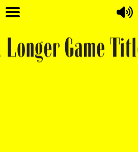
The solution was not perfect and there was an issue when the screen width was less than the width of the game title element, the game title element was cut off and not fully visible as seen in the image below.
This post details a solution to ensure the game title scales to ensure it is always fully visible.
The idea for this solution is to use the relative width from the game design files to determine the relative width the element needs to be in relation to the visible game area. For my test game, I created 2 design files in Photoshop, one in landscape orientation and one in portrait orientation.
The following image is the landscape orientation design.
The following is the portrait orientation design.
As a simple example, if in the Photoshop design for the landscape orientation of the game, the title was 600 pixels wide and the overall width of the game was 800 pixels, then we can determine the relative width is 600/800 which equals 75%. So based on this knowledge we could write code that sets the width of the game title element to 75% of the visible game width when the game is viewed in landscape orientation.
The same idea could be used to calculate the relative width of the title in portrait orientation.
We can set constant variables in our game to store the width and height of our Photoshop design files. My landscape orientation Photoshop design file is 800 pixels wide and my portrait orientation Photoshop design file is 600 pixels wide.
const LANDSCAPE_DESIGN_GAME_WIDTH = 800;
const PORTRAIT_DESIGN_GAME_WIDTH = 600;
I have set these variables as constants and will include these in my resize function. In order for the resize function to know what relative width to size the game title to, it will need to know the width of the game title element in both of the Photoshop design files. I have added two new constant variables to include this information.
const LANDSCAPE_DESIGN_TITLE_WIDTH = 600;
const PORTRAIT_DESIGN_TITLE_WIDTH = 400;
In the resize function that we are writing, we will need to know if the game orientation is currently landscape or portrait so we know which of our constants to use for our calculations. The orientation can be determined by a simple conditional. If the height of the visible game area is greater than the width of the visible game area then the game is in portrait orientation otherwise it is in landscape orientation.
The code this.game.scale.width gives us the width of the visible game area. Similarly, the code this.game.scale.height gives us the height of the visible game area.
const gameWidth = this.game.scale.width;
const gameHeight = this.game.scale.height;
The following code determines if the game is in portait or landscape orientation
const isPortrait = gameHeight > gameWidth;Now that we know the orientation, we can determine which game design width and which game design title width to use for our calculations. If isPortrait variable is equal to false then the game is in landscape orientation so we use the landscape game design width (LANDSCAPE_DESIGN_GAME_WIDTH) and landscape game title design width (LANDSCAPE_DESIGN_TITLE_WIDTH)
If isPortrait variable is equal to true then the game is in portrait orientation and we use the portrait game design width (PORTRAIT_DESIGN_GAME_WIDTH) and landscape game title design width (PORTRAIT_DESIGN_TITLE_WIDTH)
Using the game design width together with the actual visible game width, we can calculate a scaleFactor to determine the scale the game title needs to be. For example if our game is in landscape orientation and the current visible game width is 400 pixels, we calculate the scaleFactor by dividing this current width by the landscape orientation design width as follows:
const scaleFactor = 400/LANDSCAPE_DESIGN_GAME_WIDTH;This would give us a scaleFactor of 0.5 (equivalent of 50%)
Essentially this means that our game is displaying at half the size of the photoshop design size. So everything will be 50% of the size it is in the design file. We know in the landscape orientation Photoshop design file, the game title is 400 pixels wide. So if it has been scaled down to 50% of its size it will now be 200 pixels wide. It is that simple!
In our calculation above, we used a hard coded value of 400. Instead, lets use the actual screen width value which we have set to the following variable
const gameWidth = this.game.scale.width;So replacing the hard coded number with gameWidth we get the following:
let scaleFactor = gameWidth/LANDSCAPE_DESIGN_GAME_WIDTH;To calculate the width that the game title needs to be, we use the following:
this.gameTitle.setScale(scaleFactor, scaleFactor);And to ensure the game title appears half way across the screen, we use the code we used in part 2. I have also changed the vertical position so it is half way down the screen.
const newTitlePositionX = gameWidth / 2;
const newTitlePositionY = gameHeight / 2;
this.gameTitle.setPosition(newTitlePositionX, newTitlePositionY);
The following puts all the code for the game title positioning and scaling into a single scene
export default class SplashScene extends Phaser.Scene {
constructor() {
super({ key: "SplashScene" });
// Constants for positioning
this.LANDSCAPE_DESIGN_GAME_WIDTH = 800; // Width of the game in photoshop landscape file
this.PORTRAIT_DESIGN_GAME_WIDTH = 600; // Width of the game in photoshop portrait file
this.LANDSCAPE_DESIGN_TITLE_WIDTH = 400; // Width of title in photoshop landscape file
this.PORTRAIT_DESIGN_TITLE_WIDTH = 400; // Width of title in photoshop portrait file
}
preload() {
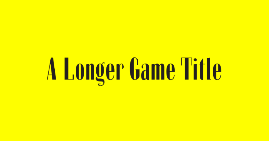
this.load.svg("gameTitle", "assets/game-title-longer.svg", {
width: 516,
height: 86,
});
}
create() {
this.gameTitle = this.add
.image(this.game.scale.width / 2, this.game.scale.height/2, "gameTitle")
.setOrigin(0.5, 0.5);
this.scale.on("resize", this.resizeTitle, this);
this.resizeTitle();
}
resizeTitle(){
const gameWidth = this.game.scale.width;
const gameHeight = this.game.scale.height;
const isPortrait = gameHeight > gameWidth;
let scaleFactor = 1;
if (isPortrait) {
scaleFactor = gameWidth/this.PORTRAIT_DESIGN_GAME_WIDTH;
} else {
scaleFactor = gameWidth/this.LANDSCAPE_DESIGN_GAME_WIDTH;
}
this.gameTitle.setScale(scaleFactor, scaleFactor);
const newTitlePositionX = gameWidth / 2;
const newTitlePositionY = gameHeight / 2;
this.gameTitle.setPosition(newTitlePositionX, newTitlePositionY);
}
}
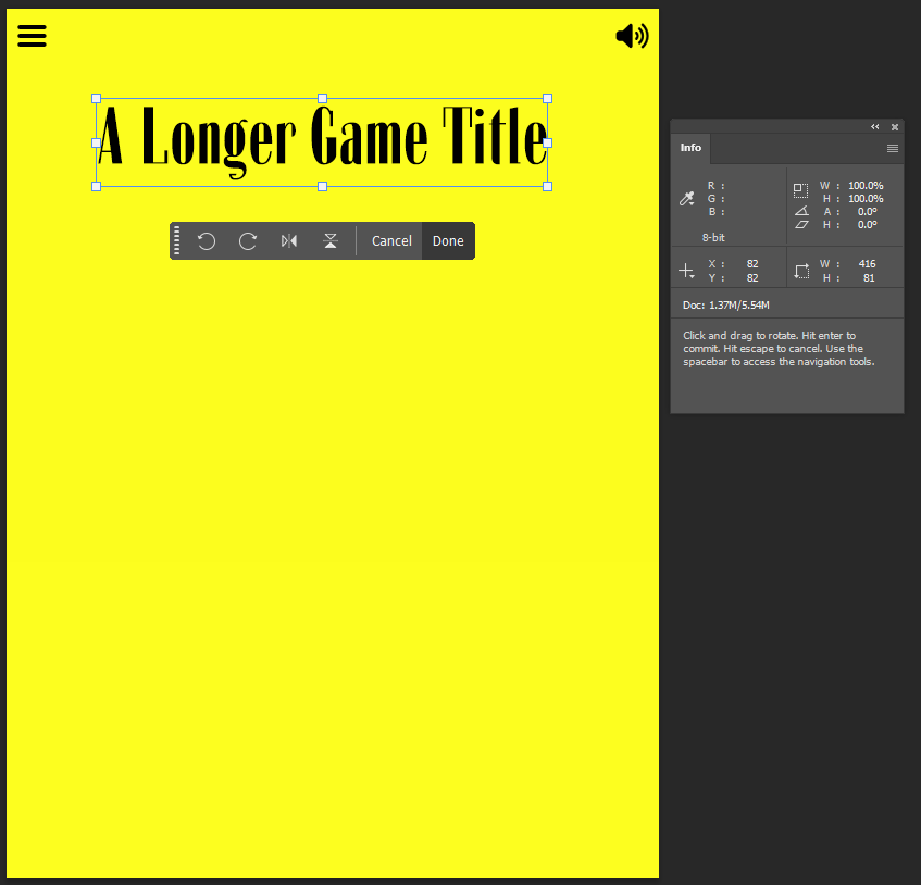
The above solution displays the game title half way down the screen as can be seen in the image below.
In my initial Photoshop design I had the game title in the top area of the design as seen below.
Post 4 will look at how to deal with the vertical position of the game title. Post 4 coming soon…