Part 2: Figuring out how to implement a responsive game in Phaser
This is a draft post of part 2 on figuring out how the scale modes in Phaser work
In part 1 of this blog article, I looked at positioning a game element at a fixed pixel offset from the right hand side of the game screen ensuring it was always visible when resizing or changing the orientation of the game screen.
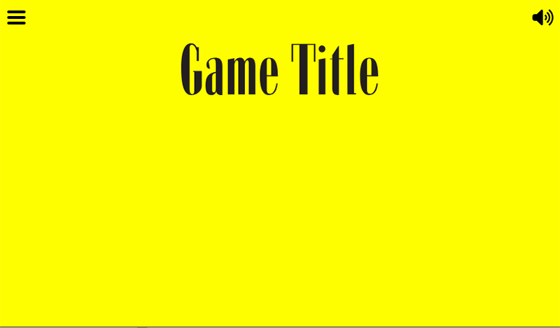
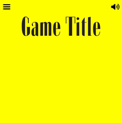
In part 2, I will look at positioning an element in the centre of the screen horizontally. I have a need to display a game title for my game on the splash screen so for this post, I will use a dummy game title element. Step one is getting this element to appear half way across the screen when the game is first launched. Step two is ensuring it remains in this horizontal central position and after any resizing or orientation changes. To simplify things for this post, I will use a fixed vertical position of 100 pixels. Here is an image showing a game title element positioned half way across the game screen.
The following code preloads our game title element. Note I have used a SVG but a bitmap such as a PNG could be used too.
function preload() {
  this.load.svg('gameTitle', './assets/game-title.svg');
}
To display it half way across the game visible area the following code is used.
function create() {
  const initialTitlePositionX = this.game.scale.width / 2;
  const initialTitlePositionY = 100;
  gameTitle = this.add.image(initialTitlePositionX, initialTitlePositionY, "gameTitle").setOrigin(0.5, 0.5);
}
In Phaser, this.game.scale.width gives the current width of the visible game screen. By default, when adding an image using this.add.image, its origin is set to (0,0), meaning the image is positioned based on its top-left corner.
However, to center the game title halfway across the screen, we need to position its center, not its top-left corner, at the desired location. To achieve this, we use:
setOrigin(0.5, 0.5);Setting the origin to (0.5, 0.5) moves the reference point of the image to its center. This makes it easier to place the image exactly in the middle of the screen.
Using this.game.scale.width / 2, we calculate the halfway point of the screen and place the image there:
const initialTitlePositionX = this.game.scale.width / 2;
const initialTitlePositionY = 100;
gameTitle = this.add.image(initialTitlePositionX, initialTitlePositionY, "gameTitle").setOrigin(0.5, 0.5);
This ensures that the center of the image aligns with the center of the screen, making positioning more intuitive.
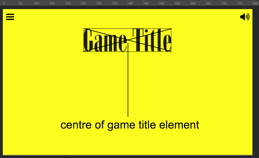
The code we have above will ensure the game title is positioned half way across the visible screen area when the game first launches but if the game is resized the following happens.
The visible screen area has reduced in width but the game title x position is still set to its initial x position.
In order for the game title element to remain in the centre horizontally after the screen is resized, code is needed to listen for resize events and to reposition the game title element using the new visible screen area width. The following code adds a listener which calls a function called repositionGameTitle every time the screen is resized. This code is added into the create function in our test game.
this.scale.on("resize", repositionGameTitle);The code for the repositionGameTitle function is as follows:
function repositionGameTitle() {
  const newTitlePositionX = this.game.scale.width / 2;
  gameTitle.setX(newTitlePositionX);  // Update X position only
}
The result of adding the above code is that the game title now remains at a centre position horizontally after the screen is resized.
As the y position of the game title element is currently using a fixed y value of 100, there is no need to set the y position when the game is resized as it will not change. The y position is relative to the top of the game screen and the top never changes and is always zero. If you did want to explicitly set it again you could use the following code that uses setPosition instead of just setX. Using setPosition allows you to include a parameter for both the x position and the y position.
function repositionGameTitle() {
  const newTitlePositionX = this.game.scale.width / 2;
  const newTitlePositionY = 100;
  gameTitle.setPosition(newTitlePositionX, newTitlePositionY);  // Update X and Y position
}
So we now have a game title that will display half way across the screen when the game launches and will remain in this central horizontal position when the sceeen is resized or rotated.
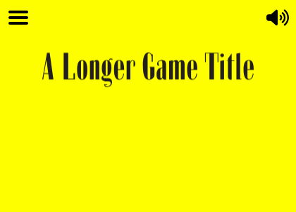
But!!!! What would happen if the game title element was a longer title with more words? The code we have written ensures it is always positioned half way across the visible game area and it looks fine in the image below.
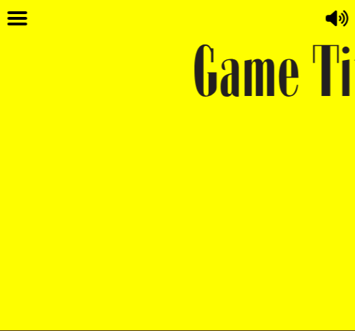
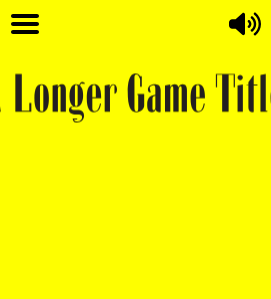
However, there may come a point when the screen width becomes less than the width of the game title and the game title can’t fit on screen. Hence the text disappears off the left and right hand side of the screen as can be seen in the image below.
In order to ensure the entire game title is visible within the visible game area, the title will need to be scaled. Part 3 covers a solution to ensure the image scales so it is always fully visible.