Part 1: Figuring out how to implement a responsive game in Phaser
This is a draft of a post on figuring out how the scale modes in Phaser work

I am making a simple game in Phaser to help me understand the Phaser scaling modes. I want my game to be responsive and adjust to whatever size of screen or orientation the game is being played on.
I have chosen to try getting the RESIZE scaling mode to work for my needs as it appears to be the most appropriate. With this mode, the visible area (or the canvas) dynamically resizes to fill the browser window or the element you’ve designated as its parent, such as a div container. However, it’s important to note that this doesn’t mean the entire game world resizes. The game world remains at its defined size, but the visible area that the player can see is adjusted to fit within the new screen dimensions. If the browser window is resized, the game world might extend beyond the visible area, with parts of the game world becoming off-screen.
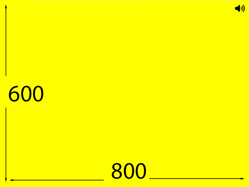
I have set up a simple test where I display an audio button in the top right corner of a 800 x 600 game area. I have positioned the audio button at an x position of 774 and a y position of 26. When viewing on a screen that is 800 x 600 I can see the audio icon as seen in the image below.
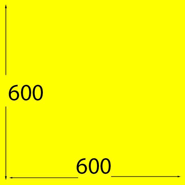
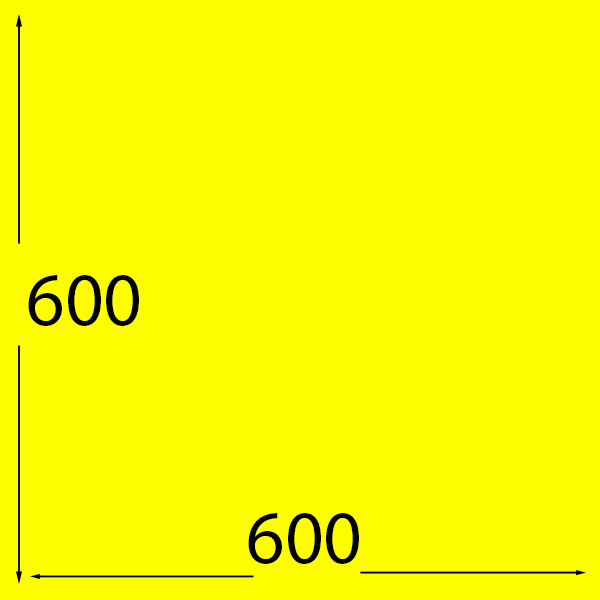
If I change my browser window so it is only 600 pixels by 600 pixels, what happens? My audio button is no longer visible. Because the width of the game has changed from 800 pixels wide to 600 pixels wide and the audio button is positioned at an x position of 774, it cannot be seen now and is effectively off screen to the right.
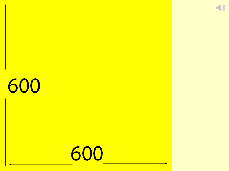
The following image illustrates this. The bright yellow area is the visible area the user can see.
So how do I ensure the audio button is visible on the different screen sizes? Instead of displaying the audio button at a fixed x position I can instead use the current visible screen width and offset the position of the audio button from this.
To get the value of the current visible screen width the following is used:
this.game.scale.width
To display the audio button initially the following code can be used:
function preload() {
  this.load.svg('audioIcon', './assets/audio-on.svg');
}

function create() {
  const buttonWidth = 32;
  const buttonHeight = 32;
  const offset = 10; // How far from edge to display button
  const initialPositionX = this.game.scale.width - offset - buttonWidth / 2 ;
  const initialPositionY = offset + buttonHeight / 2;
  this.add.image(initialPositionX, initialPositionY, "audioIcon").setOrigin(0.5, 0.5);
}
Note I am loading a SVG image but you can also load a bitmap image such as a PNG. Also note I am setting the origin of the button to its centre using the setOrigin(0.5, 0.5) code. That is why I subtract half the button width and add half the button height in my position code.
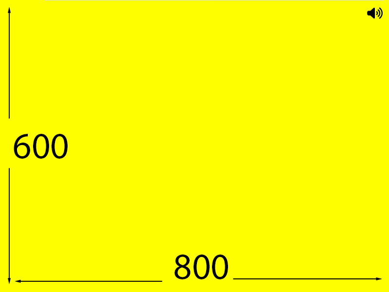
The image below shows how the audio button is displayed when viewing on a screen that is 800 x 600. It looks the same as when I had set the position using a hard-coded x value of 774 and and hard coded y value of 26.
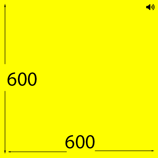
If I resize the browser window to 600 x 600, as before the audio icon vanishes.
Things may appear the same but there is a difference. If you refresh the page (F5 key in windows) when viewing at a size of 600 x 600, look what happens!
The audio button is visible. That is because we initially set the position based on an offset from the current visible area size and when doing the calculations the visible area width was 600 so it calculates an offset from this and makes the audio button appear within the visible area.
The next step is to ensure the audio button stays in the visible area when the screen is resized….
In order to keep the audio button in the visible area when the screen is resized the game needs to listen for any changes in the screen size and reposition the audio button based on the new screen size.
The following is the code to listen for such a change.
this.scale.on("resize", repositionAudioButton);The this.scale.on is used to listen for scaling (resize) events in Phaser and allows you to call a function when the game window resizes. I am using this to call a function I have written called repositionAudioButton as seen in this code.
function repositionAudioButton() {
  const buttonWidth = 32;
  const offset = 10; // How far from edge to display button
  const newPositionX = this.game.scale.width - offset - buttonWidth / 2 ;
  audioButton.setX(newPositionX);  // Update X position only
}
The code in this function is very similar to the code for the initial position – almost identical though I do not need to set the Y position again as even when the screen height changes the top will always be zero. I could have done the following if I had wanted to set the y position again but it is not necessary because the y position will not have changed. Note I have duplicated the constants (buttonWidth, buttonHeight and offset) in this function just to help with the explanation. Ideally the constants only need declaring once. Don’t Repeat Yourself (DRY).
function repositionAudioButton() {
  const buttonWidth = 32;
  const buttonHeight = 32;
  const offset = 10; // How far from edge to display button
  const newPositionX = this.game.scale.width - offset - buttonWidth / 2 ;
  const newPositionY = offset + buttonHeight / 2;
  audioButton.setPosition(newPositionX,newPositionY);
}
Now we can change the screen size and even rotate the orientation and the audio button will stay in the top right corner and always be visible.
And another example of the above rotated
There is only one element in this test game so far but if there were multiple elements that needed repositioning every time the screen is resized then it is a good idea to create some code to reposition all the elements rather than have a separate function for each element to take care of its position.
If the game was to be displayed on a large desktop screen the current size of the audio button (32 x 32) would look very small and could benefit from its size being scaled up too. Also 32 x 32 is a little too small for use on a mobile or touch screen device. Googles Material Design recommends a minimum of 48 x 48 pixels and Apple’s Human Interface Guidelines recommend 44 x 44 pixels. So at the very least I should update this blog post to use at least 44 x 44 minimum sized buttons but will try and go even bigger (64 x 64) for improved accessibility.
The next post will look at how to display an image aligned to the horizontal centre of the visible game area.